Tremain Media is a dynamic and comprehensive media and marketing agency that prides itself on delivering top-notch services to its valued clients. Tremain Media recognized the need to revamp its brand identity and align it with the current industry trends. With a focus on creating a more contemporary image, Tremain Media embarked on a journey to update its visual identity to better resonate with its target audience. The goal was to create a brand that not only looked stylish and modern but also conveyed the company's unique personality and values, which are rooted in exceptional customer service and a client-centric approach.
LOGOS
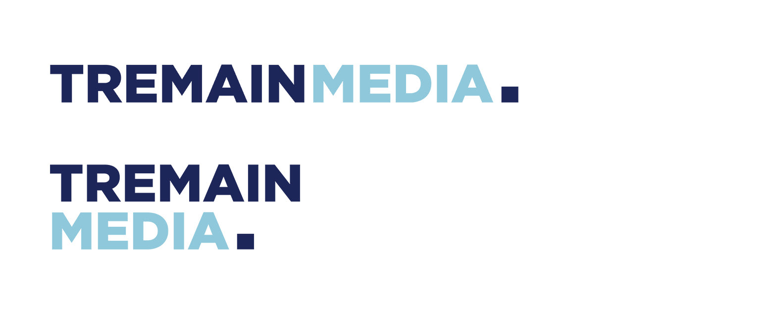
ORIGINAL LOGO

NEW LOGO AFTER REBRANDING
The box encasing the word MEDIA was shrunk down to create the period at the end of the logo. This creates a more confident and purposeful feel.
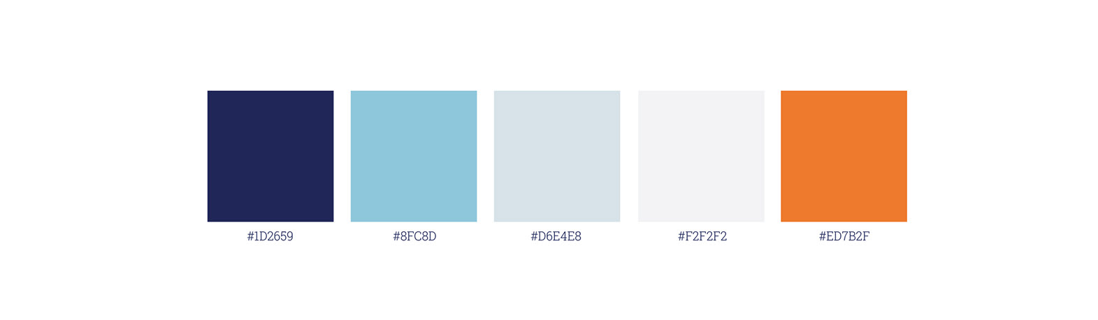
COLOUR PALETTE
The colour palette conveys different characteristics, both of which are derivative of Tremain Media’s brand personality. “Ignite Orange” is meant to be assertive and energetic, while “Inform Blue” conveys academia and integrity. “Light Blue” and “Pale Grey” can be used to provide balance and lightness.
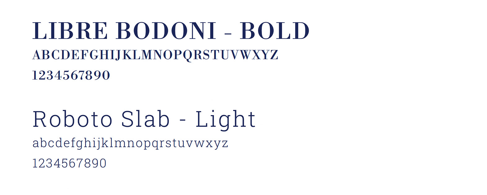
TYPOGRAPHY
Tremain Media’s typography was carefully considered to reflect the brand’s voice and carry on its message to “ignite, communicate, and empower.”
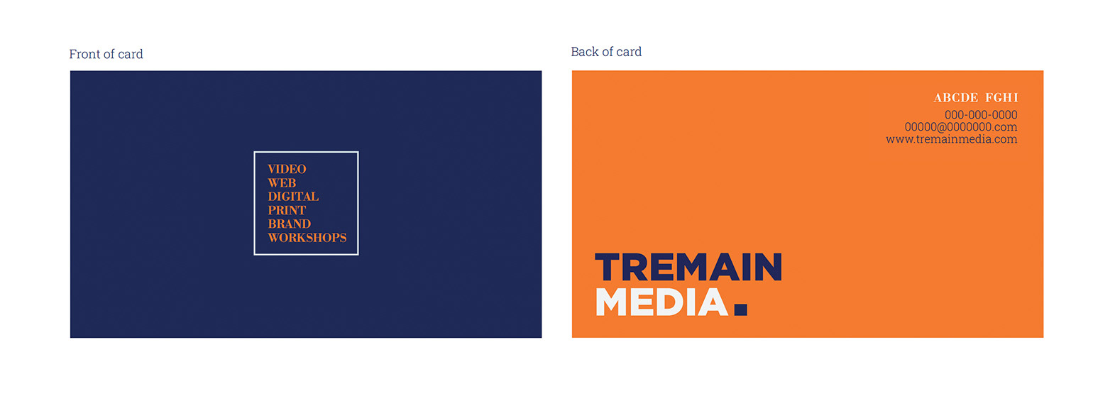
BUSINESS CARD
The minimalistic, bold design of Tremain Media’s business card is fresh, modern, and distinctive.