We developed a brand for Lana Eagle's consulting business, which focuses on building connections between indigenous communities, industry, and government. Lana organizes webinars, speaking events, educational talks, and podcasts to facilitate communication. The brand design is specifically tailored to reflect Lana Eagle's business, showcasing her commitment to providing equal opportunities for indigenous peoples and promoting an understanding and appreciation of diverse world views. The preferred brand design attributes include simplicity, cleanliness, clarity, and boldness, employing a minimal color palette. It aims to create a collaborative space where all voices are heard and where everyone feels a strong sense of belonging.
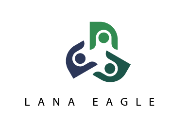
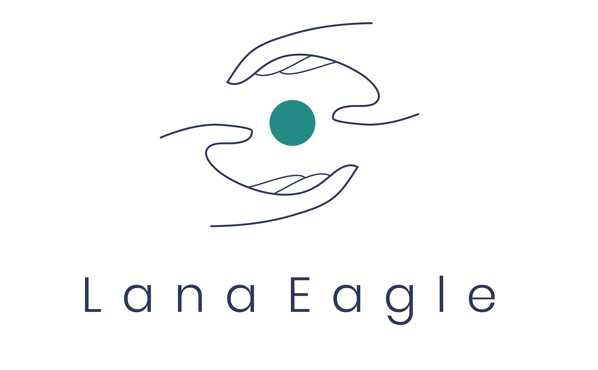
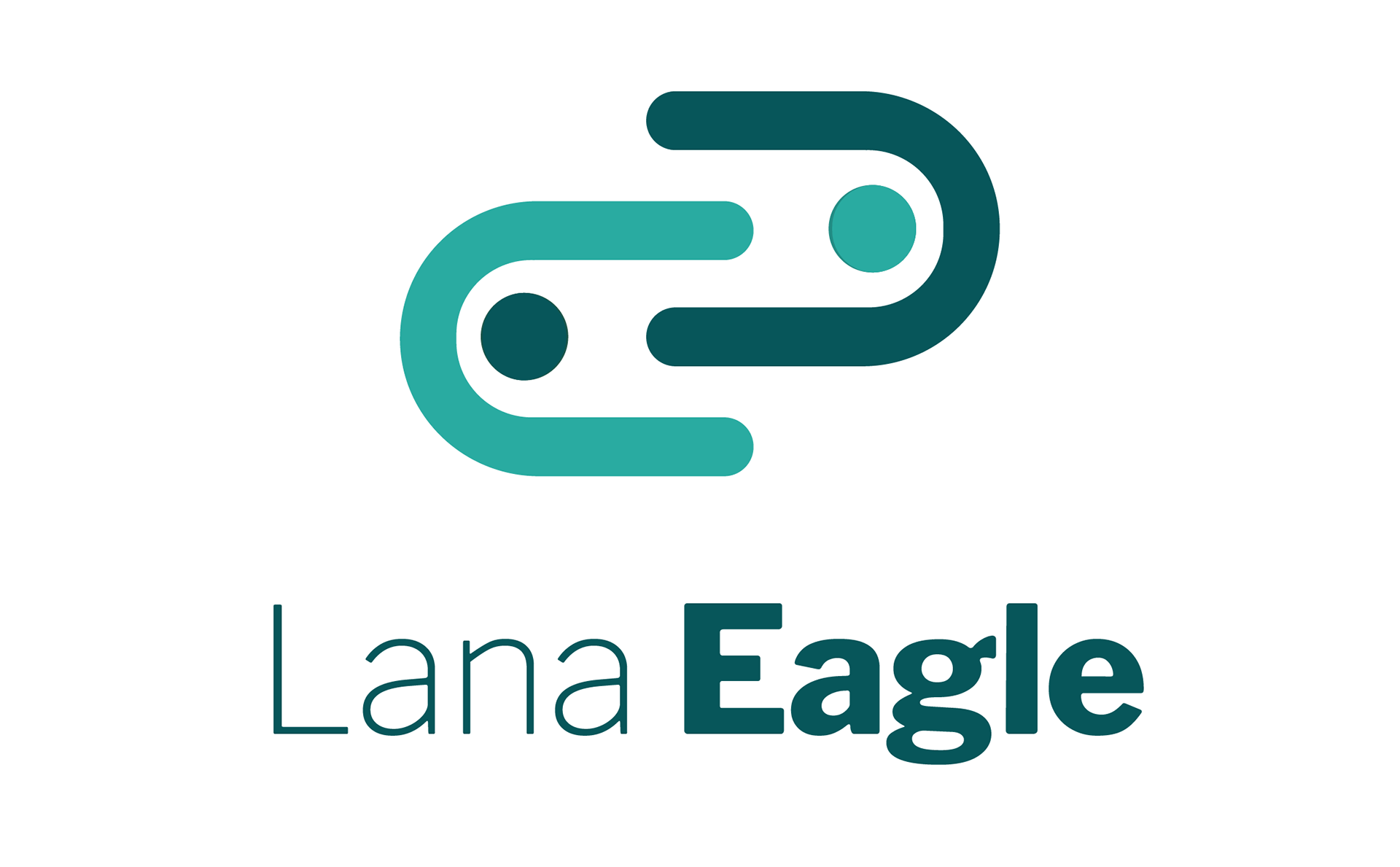
LOGOS
HORIZONTAL LOGO

STACKED LOGO
OTHER LOGO VERSION MOCKUPS

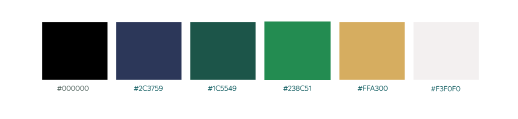
COLOUR PALETTE
The color palette chosen for this consulting company, working between indigenous peoples, industry, and government, holds deep significance. The greens symbolize a connection to nature and sustainable practices, reflecting the company's commitment to harmonizing traditional knowledge with modern development. The cool dark purple represents dignity and respect for indigenous cultures. The incorporation of gold and cream adds sophistication and signifies the company's professionalism in navigating complex sectors. This thoughtfully crafted color scheme visually represents the company's mission to facilitate collaboration and understanding between indigenous communities and stakeholders.
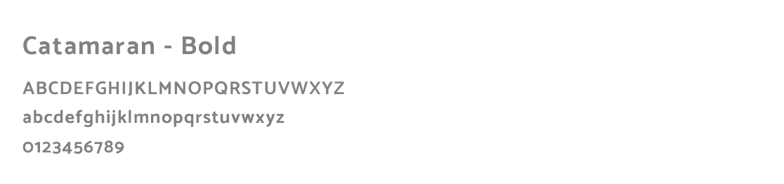
TYPOGRAPHY
The chosen font for Lana Eagle's brand, Caracaran, embodies a harmonious blend of clarity and subtlety. As a San serif font, it exudes a contemporary and sophisticated vibe that aligns perfectly with Lana Eagle's professional image. Caracaran's distinguishing feature lies in its soft curves, which gracefully complement its gentle capitals. This combination creates a balanced and inviting aesthetic, making it an ideal choice for both Lana Eagle's bold statements and regular text. With Caracaran as the cornerstone of Lana Eagle's typographic identity, she conveys a sense of approachability, competence, and modernity to her clients.
MAIN BRAND FONT
SECONDARY FONT