The client has specifically requested a campy, Wes Anderson-inspired style for their brand, which is a summer art camp for children. The goal was to create a playful and whimsical atmosphere that captures the essence of summer camp. The use of warm, muted colors, quirky illustrations, and bold typography will be key in achieving this aesthetic. By emulating the fun and carefree nature of summer camp, the brand hopes to appeal to both children and parents alike. The overall design will be approachable and inviting, while also conveying a sense of creativity and imagination. Ultimately, the goal was to create a memorable and enjoyable experience for all who interact with the brand.
LOGOS
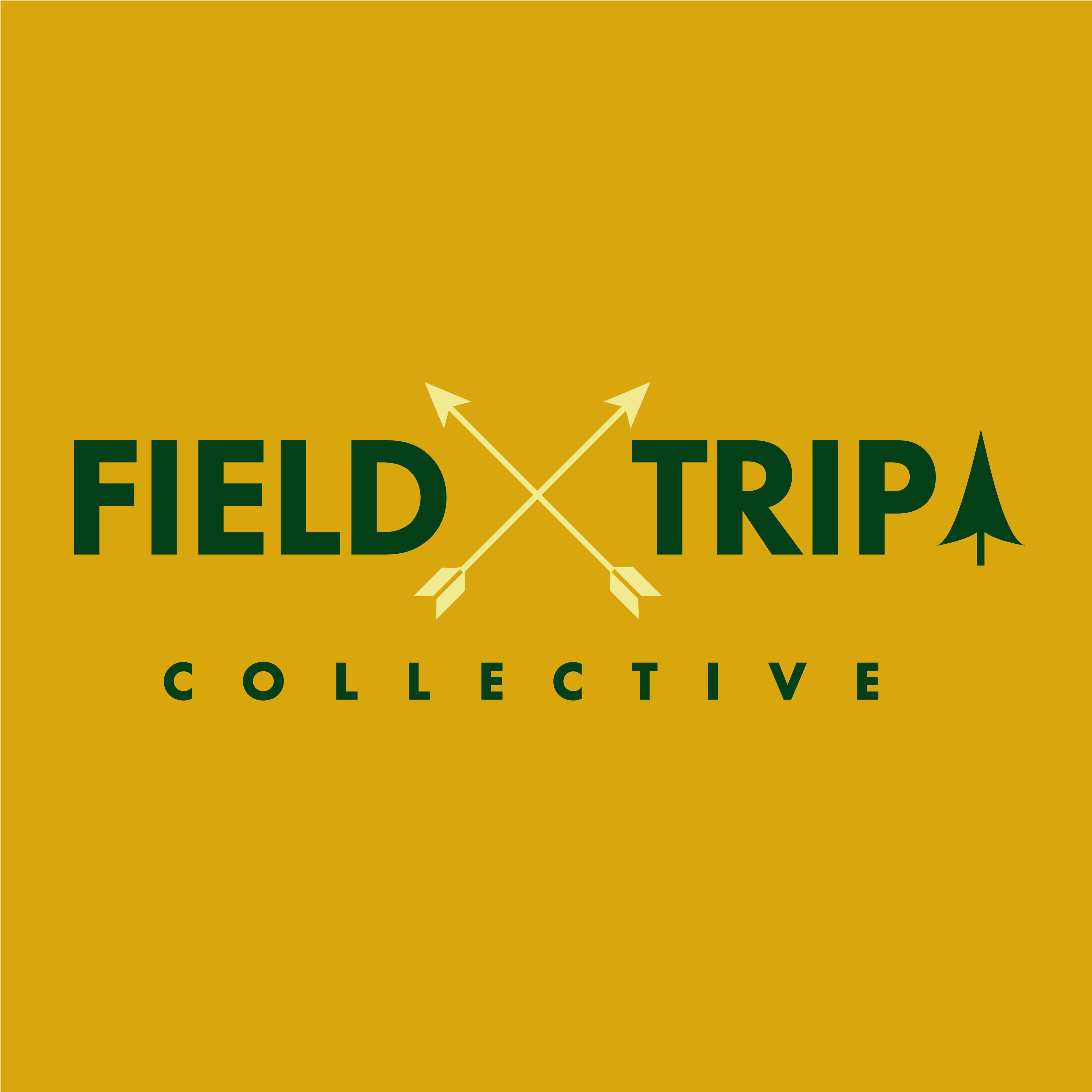
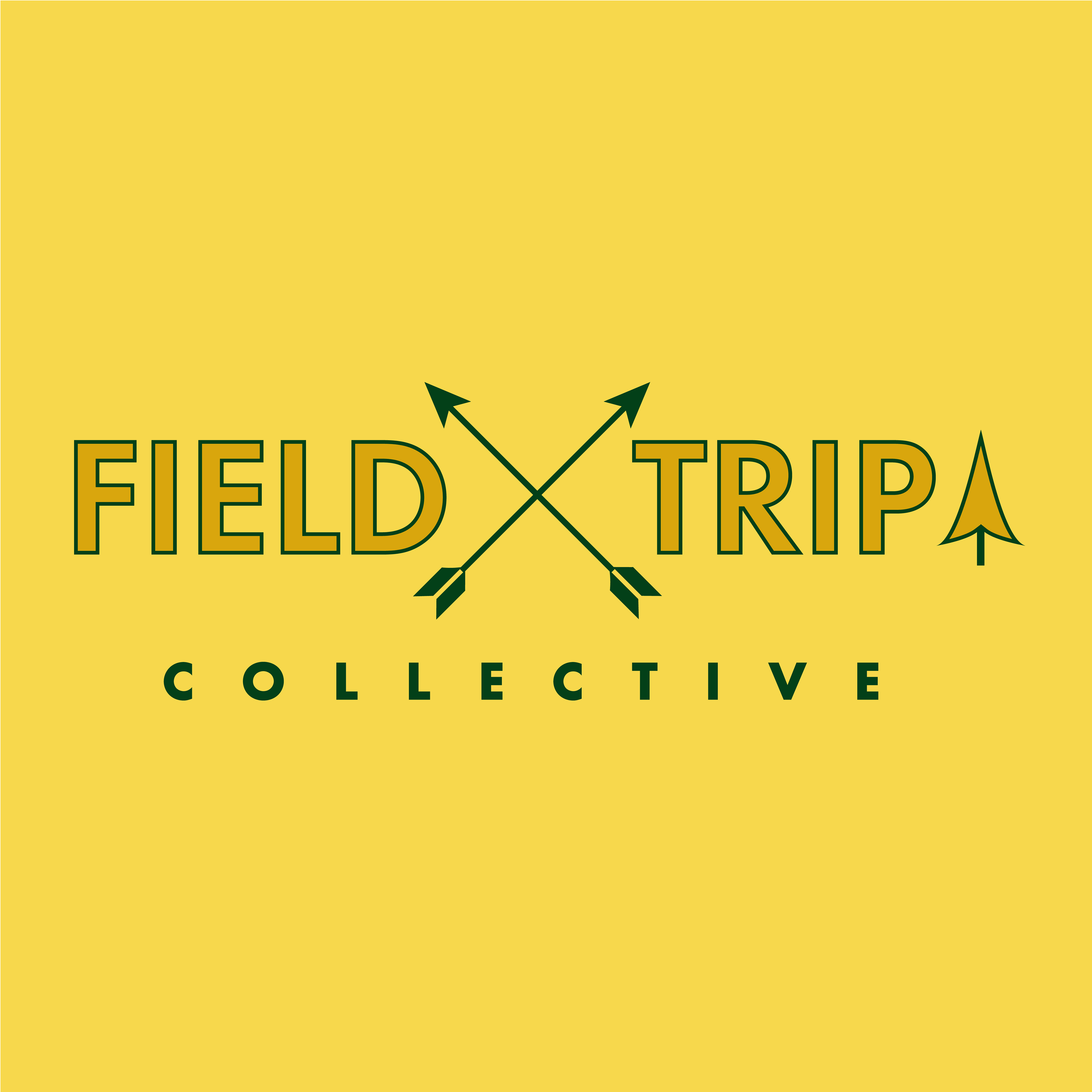
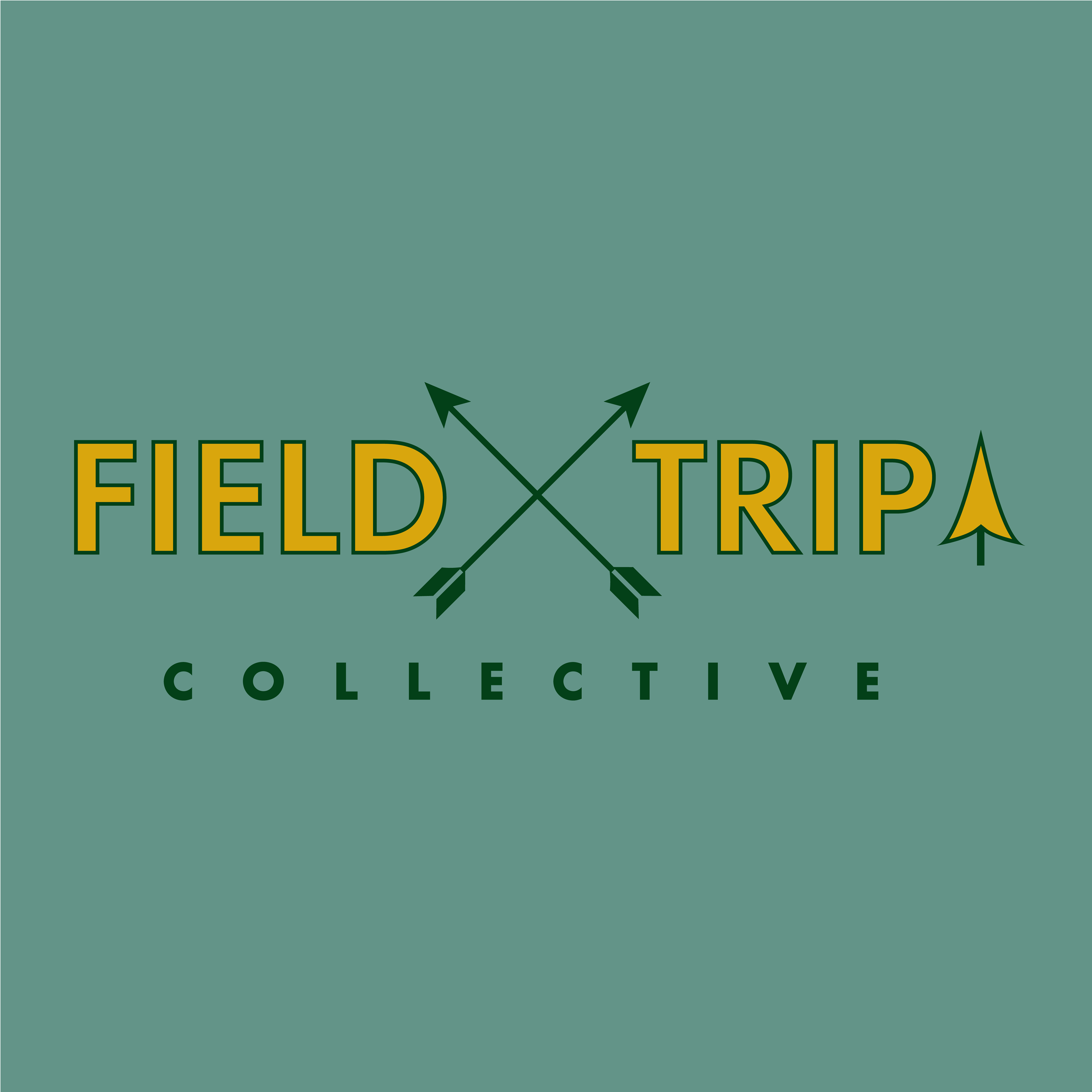
Main Logo in black and white

We created three color variations
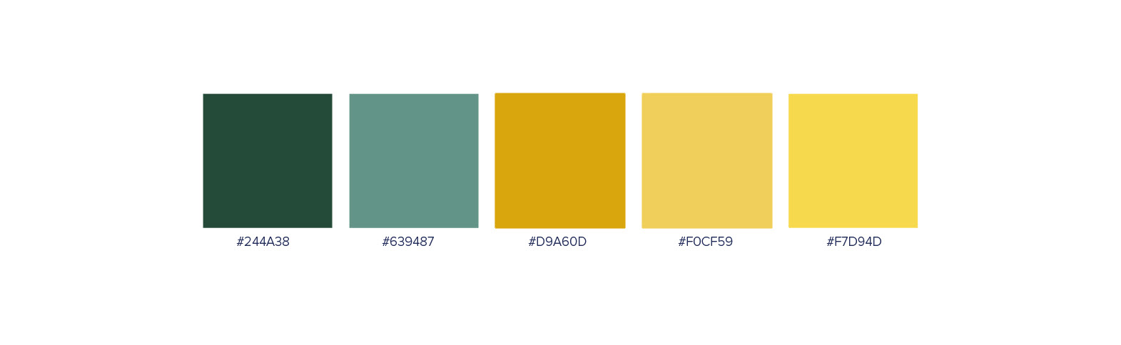
COLOUR PALETTE
The color palette chosen for this brand is a perfect representation of the antique 50s style that the brand is emulating. The dark muted greens and warm golds used in the palette are both inviting and sophisticated, creating a sense of nostalgia and warmth. The greens evoke a sense of nature and growth, while the golds add a touch of luxury and elegance. Together, they create a harmonious balance that is both visually appealing and emotionally engaging. The use of these colors in the brand's design will help to establish a solid visual identity that is both memorable and unique.
TYPOGRAPHY
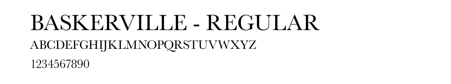
The combination of the two fonts creates a unique and memorable visual identity that is both sophisticated and playful. The first font, with its bold and geometric shapes, evokes a sense of the 50s style and adds a modern twist to the overall aesthetic. The second font, with its elegant and flowing script, adds a touch of vintage charm and elegance to the brand's design. Together, these fonts create a harmonious balance that is both visually appealing and emotionally engaging.
MAIN BRAND FONT

SECONDARY FONT